Choosing the Right Words: Emily's Idea by Christine Evans
craft review by Anne-Marie Strohman
Picture book writers are often told two contradicting pieces of advice: 1) BE SPECIFIC and 2) LEAVE ROOM FOR THE ILLUSTRATOR, which translates to don’t be too specific. Both things are true. A text should include specific details in the text, but also must leave room for the illustrator to expand the story.
In her picture book Emily’s Idea, Christine Evans finds that elusive balance and creates a story with specificity AND room for the illustrator to tell their part of the story. (See our interview with Christine Evans here.)
Leaving Room for the Illustrator

Much of Evans’s text uses general words that leave room for the illustrator. For instance, on the second spread, the text reads, “Emily’s small idea grew. Until her room was alive with pattern and color.” She leaves room for the illustrator to determine what patterns and what colors. Those details aren’t important to the story, and keeping the words general allows the illustrator to create a gorgeous image using her own imagination.
The paper dolls are described as “different, but the same.” Evans uses this as a kind of refrain, She never describes the paper dolls, and that leaves the illustrator, Marta Alvarez Miguens, plenty of opportunity to create a visual story.
Similarly, Evans repeats that “Emily’s idea grew.” Miguens increases the number of paper dolls in the illustrations as the story moves along, and that supports some of the specific details Evans uses to show that her idea grew not just in the number of paper dolls, but in other ways.
Specifics to Support Theme and Story
Evans uses specific details and place names to communicate her theme--that people are all different, but the same--and to show the specific way that Emily’s idea is growing.
It starts with a specific moment--”On share day”--in a specific classroom--”Ms. Tate and room 6B.” Her teacher and classmates are inspired to make their own paper dolls. The number of paper dolls increases, but more, “It was a connection.” Here, Evans names the students to show this different kind of growth--”Between Luca and Evelyn. Between Annabelle and Nico. Between Leah and Henry.”
As Emily’s idea expands, Evans names specific places--the bakery, the hair salon, the post office--to show how the idea and the paper dolls are spreading geographically. The geographic specifics continue later as Emily’s idea spreads around the globe--”Japan and Australia. Qatar and Iceland. South Africa and Mexico.” These specifics underscore the storyline that Emily’s idea has expanded globally, and shows the connections among people: the stories she puts in her scrapbook are about “Hands holding hands”--about connection.
A Word About Art Notes
General advice is to use as few art notes as possible. This is great advice! But sometimes you will need to use art notes, in cases where the text says the opposite of what the art should show, for a visual joke, and in cases where an important element of the illustration is not mentioned in the text.
For instance, in Evans’ text, the illustration on the first page shows Emily cutting paper dolls, but the text doesn’t mention them: “Emily’s idea started small. Many beautiful ideas do. She folded, doodled, and snipped.” It’s not until the third spread that the text mentions paper dolls. Paper dolls are mentioned three more times in the text, and “chains” of paper dolls are mentioned once.
For an agent, editor, or illustrator reading the manuscript, it’s important for them to visualize paper dolls from the very first page. If they imagined that Emily was cutting out snowflakes and then were surprised by paper dolls two spreads later, the reader would have to change their visual image, and it would disrupt their reading of the story.
I asked Christine how the opening of her manuscript read when she sent it to her agent. Here’s her manuscript for that first spread:
“Emily’s idea started small. Many beautiful ideas do. She folded, doodled, and snipped. [art: one paper doll]”
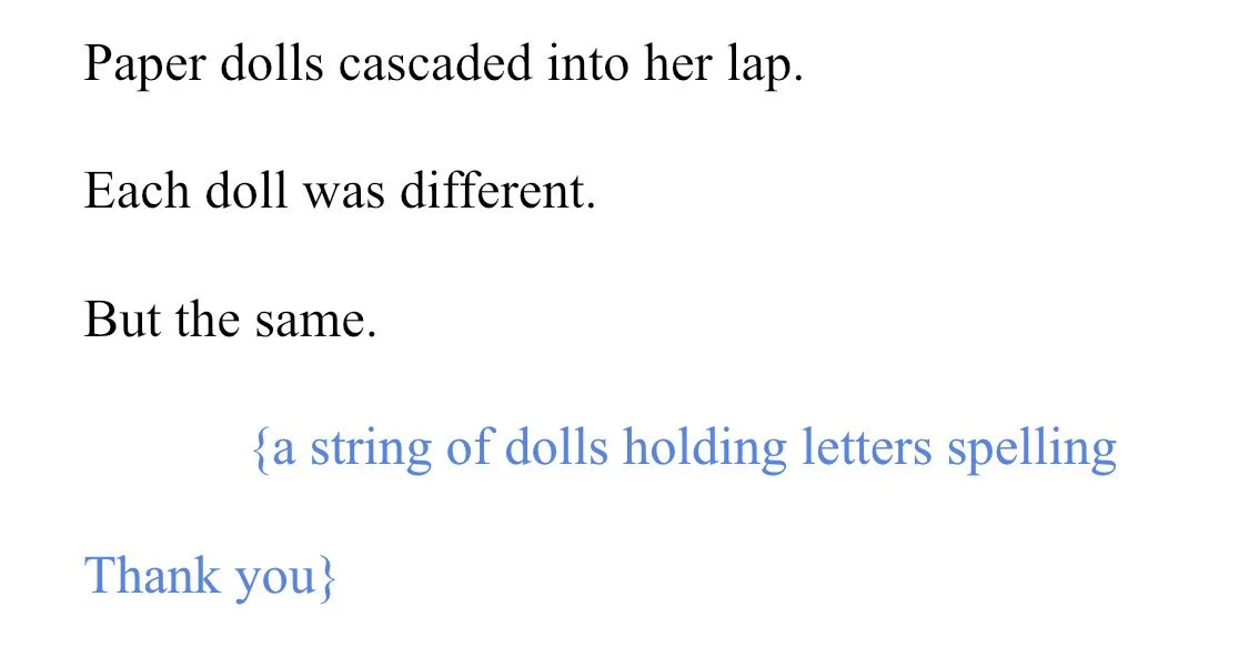
In fact, Christine shared with me that she only included THREE art notes in the entire manuscript. The second one was for the sixth spread: “And still, Emily’s idea grew. [art: teacher posts on photo on social media and it goes viral].” The third art note ended up being on the final spread: “Each doll was different. But the same. [art: a string of dolls holding letters spelling ‘Thank you’]”
Christine says, “One of my favorite things about the book is all the details Marta added, like the kids making paper dolls together, each at a different stage in the process.” Leaving room for the illustrator makes it possible for the story to come alive in new ways.
Now It’s YOUR Turn
Look over one of your picture book manuscripts. Use different colored highlighters to mark 1) specific details and 2) words that leave room for the illustrator. Then examine each spread.
Are the details necessary to the story?
Do the details support the theme of the story?
Are the general words too vague?
Where do you leave room for the illustrator?
Where will a reader of the manuscript be confused?
If you’ve included art notes, really look at each one.
Is it necessary for the reader to understand the story?
Does it include just the absolutely necessary information? (If it includes extra, trim, trim, trim.)
Is there a way to include the necessary information in the text in an elegant and succinct way? (If so, consider revising the text and eliminating the art note.)
Special note: You can find an activity kit for Emily's Idea here.


"I started out writing for adults and so when I published my first children’s book, after 15 years of writing for adults, I couldn’t believe what a warm welcome I got. People were immediately supportive and eager to share information. The collegiality of kidlit authors is one of the things that I love the most about this field."